Designing a first-run tutorial for K9 Genius
Five steps, one guide dog, three kinds of users.

K9 Genius is a gamified dog-training app. The home screen has a lot on it, and new users didn’t know where to start.
I designed the tutorial flow, from wireframes to final screens and copy. Try it below.
Mind sharing your take as a user?
You just tried the prototype. A few quick taps tell me if the flow guides or gets in the way.
No problem. whenever you like.
Thanks for testing.
Your feedback is in. It helps me see the flow through fresh eyes.
The problem
We tested the dashboard internally, then with people who had never seen the app. I can’t share the numbers, but the pattern was easy to spot:
- They missed where to continue a lesson.
- The Dog Park and The Park Shop went unopened.
- Trial users didn’t know how long their trial was.
So we went back and designed a guided first run.
Guide, don’t distract
The home screen was already busy. A welcome carousel or a modal per feature would only make it busier.
So I set one rule: the tutorial adds nothing new to the screen. It only points at what’s already there.
- A light dim, with the real screen still visible.
- One element and one short line per step.
- Close any time. No step takes you to another page.
- Jaha and the lime accents come from the app, so it feels native.
One tour, three users
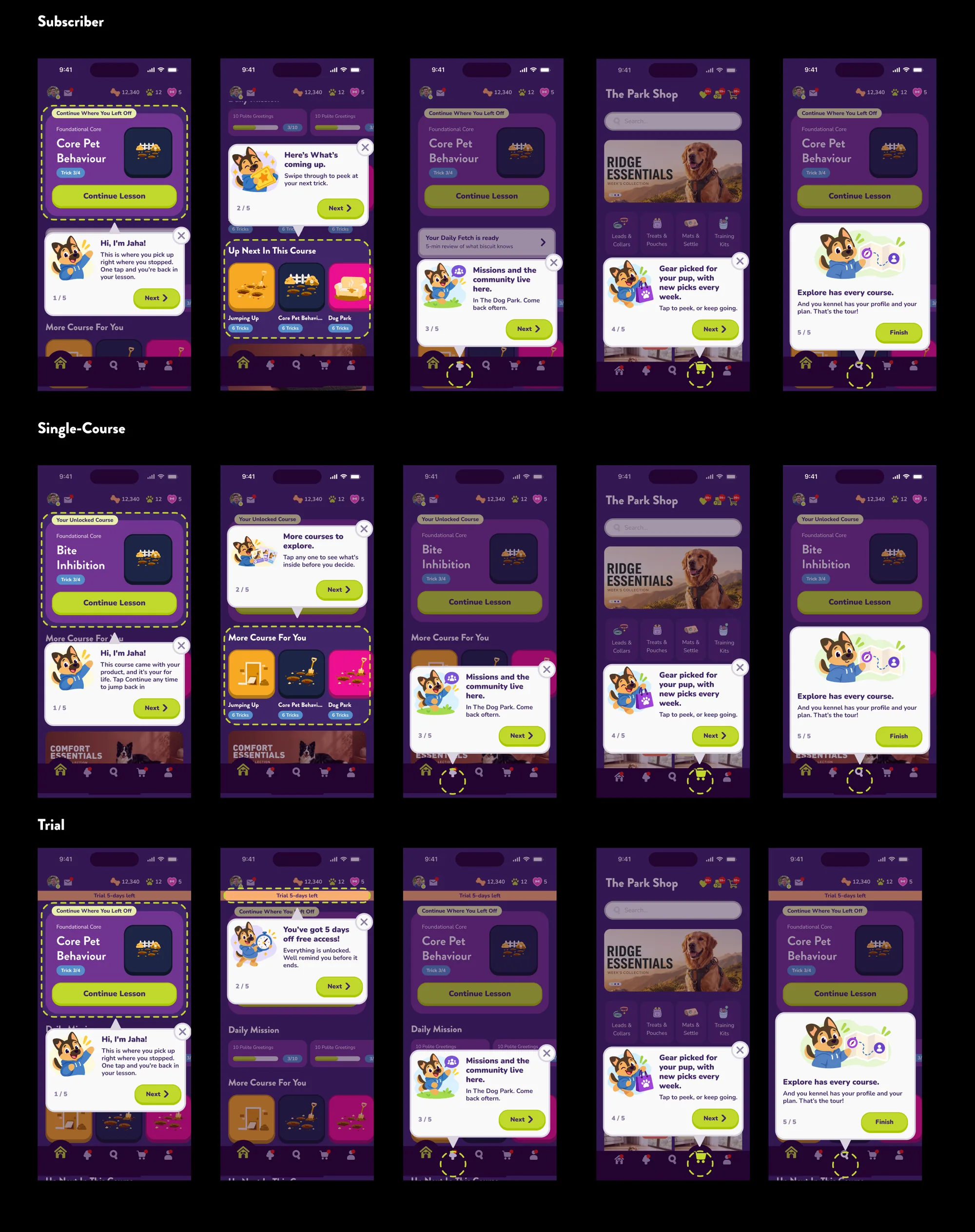
Not everyone sees the same dashboard. Subscribers have a course in progress, single-course owners got one course with a K9 product, and trial users have five days.
Steps 1 and 2 change for each of them. Steps 3 to 5 stay the same.
*Hover or tap a user type to see their tour
Small decisions
Jaha does the talking. A mascot fits a gamified app better than help text.
Rings for tabs. Cards get a dashed outline, bottom-bar tabs get a ring, and the pointer always lines up with the target.
No “Take a peek”. The wireframe had a button that opened the shop mid-tour. I removed it so people finish the tour first.
Wireframes to final
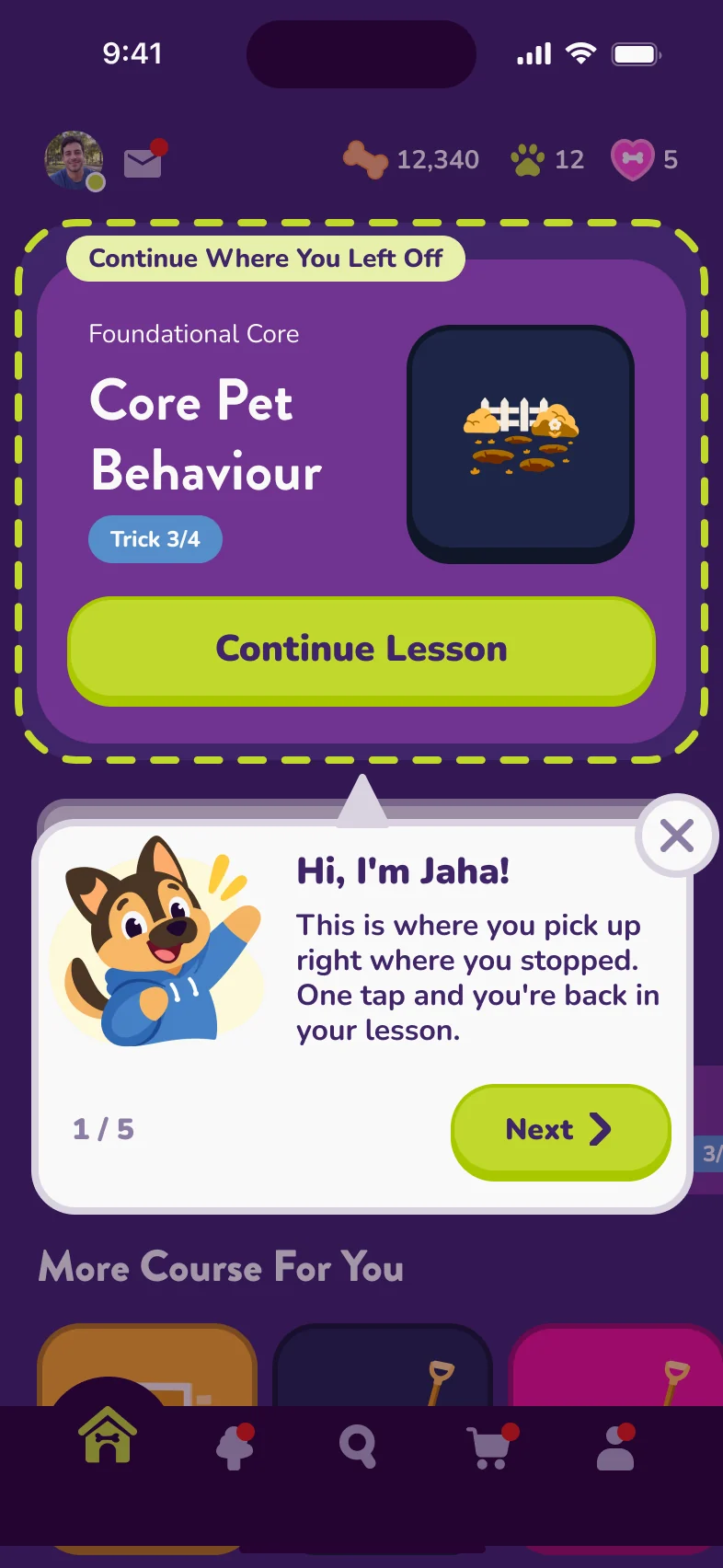
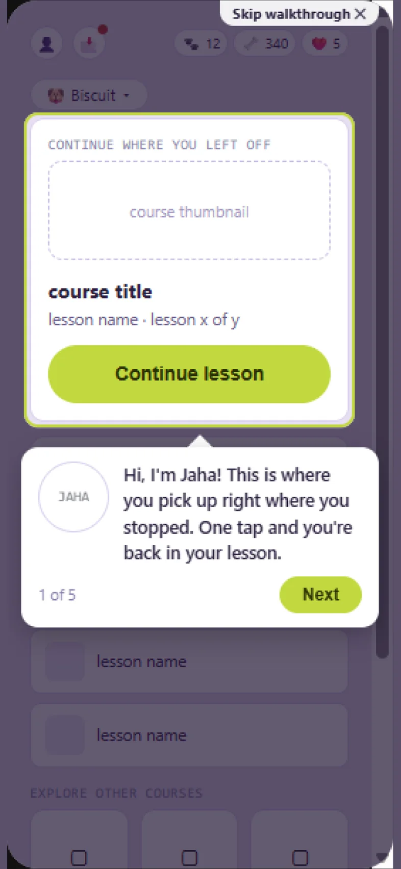
The order barely changed between the first wireframes and the final screens. The details did. Drag to compare.
What we expect
It hasn’t shipped to everyone yet, so there are no numbers. We’ll watch how many people finish the tour, tap Continue Lesson first, and open The Dog Park in their first week.
What I learned
Most of the iteration was on what Jaha says, not the layout. And mapping the three user types early saved us from designing three separate tours.
Written by M Fathir Ramadhennis
Indonesia-based Product Designer with 3+ years of experience across different industries and digital products.