LID: helping families plan a move abroad
A client project, end to end: from a two-way brief to flows, IA, wireframes and a build-ready UI.

LID helps families plan a move to another country: where to go, what it costs, and what to do first. The client came with a clear brief and a full set of requirements. My job was to turn that into a product a family can actually use.
Everything below is live. Pick a flow and try it.
Mind sharing your take as a user?
You just tried the prototype. A few quick taps tell me which flow felt clear and which didn’t.
No problem. whenever you like.
Thanks for testing.
Your feedback is in. It helps me see the flow through fresh eyes.
The brief, both ways
The brief was solid, so the real work was asking the right questions back. These four shaped the product.
It becameThe family is the core object. Profile, progress and plans belong to the household, not one login.
It becameAn 8-step intake that only asks what changes the ranking: family, lifestyle, goals, money, school and health.
It becameSide by side, two countries at a time, on the five things that matter: cost, rent, visas, healthcare, tax.
It becameA relocation plan in six steps, starting with the one that blocks everything else: the visa.
How I worked
Double Diamond, kept lean: open up during the brief, narrow down to flows, open up again in wireframes, then commit. Click a phase.
Job to be doneWhen our family is thinking about moving abroad, we want to see which countries fit us and what it takes, so we can decide together without guessing.
User flow
One main path, with help always one click away. Click any step to open it in the prototype.
Information architecture
Six places in the sidebar. Everything about the move itself sits under one parent, Life Itinerary, so the sidebar stays short.
Orange = the one grouped section. Click a node to open it.
Wireframes to final
I wireframed in grey first, to agree on structure before style. Drag to compare.
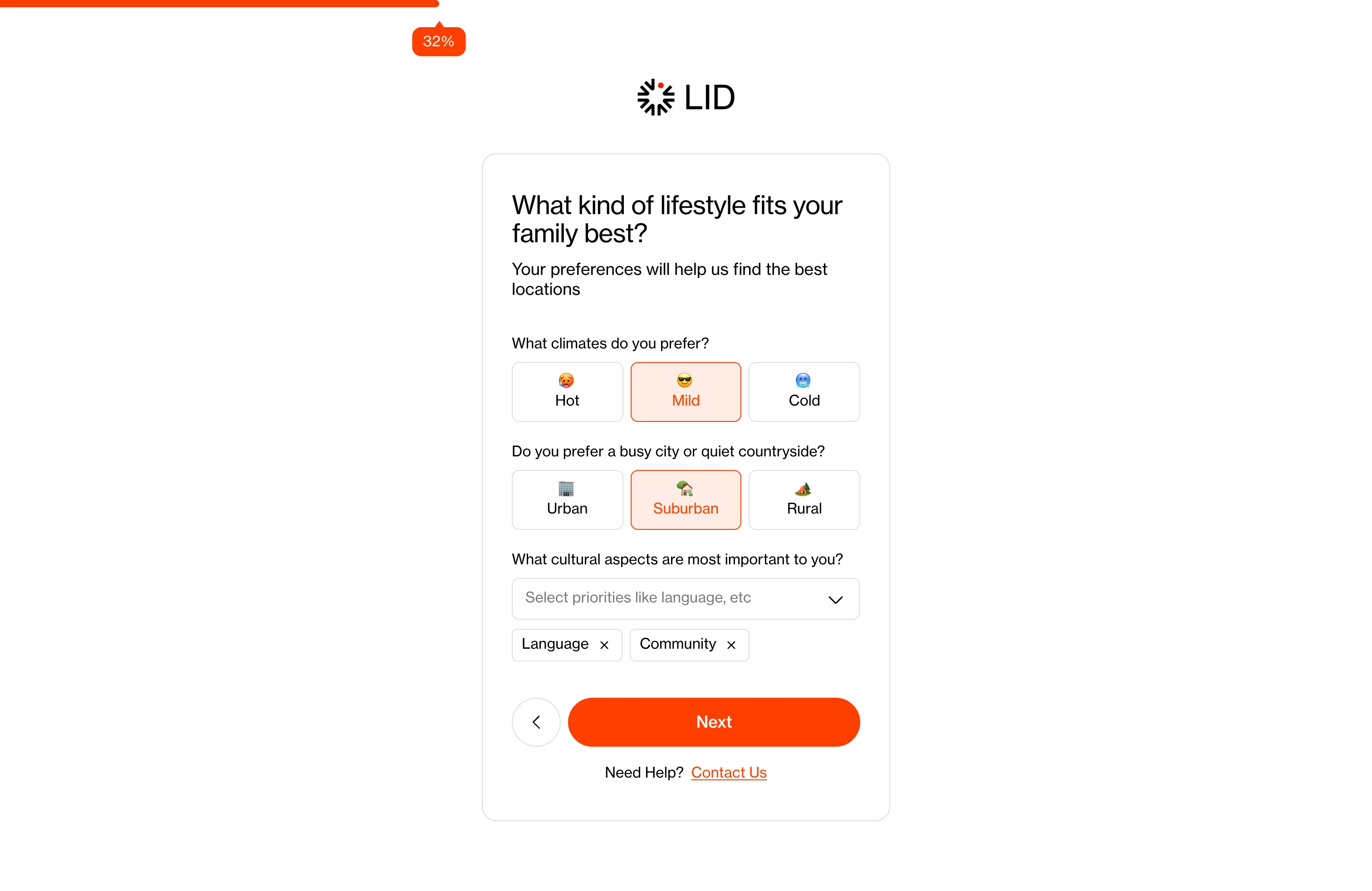
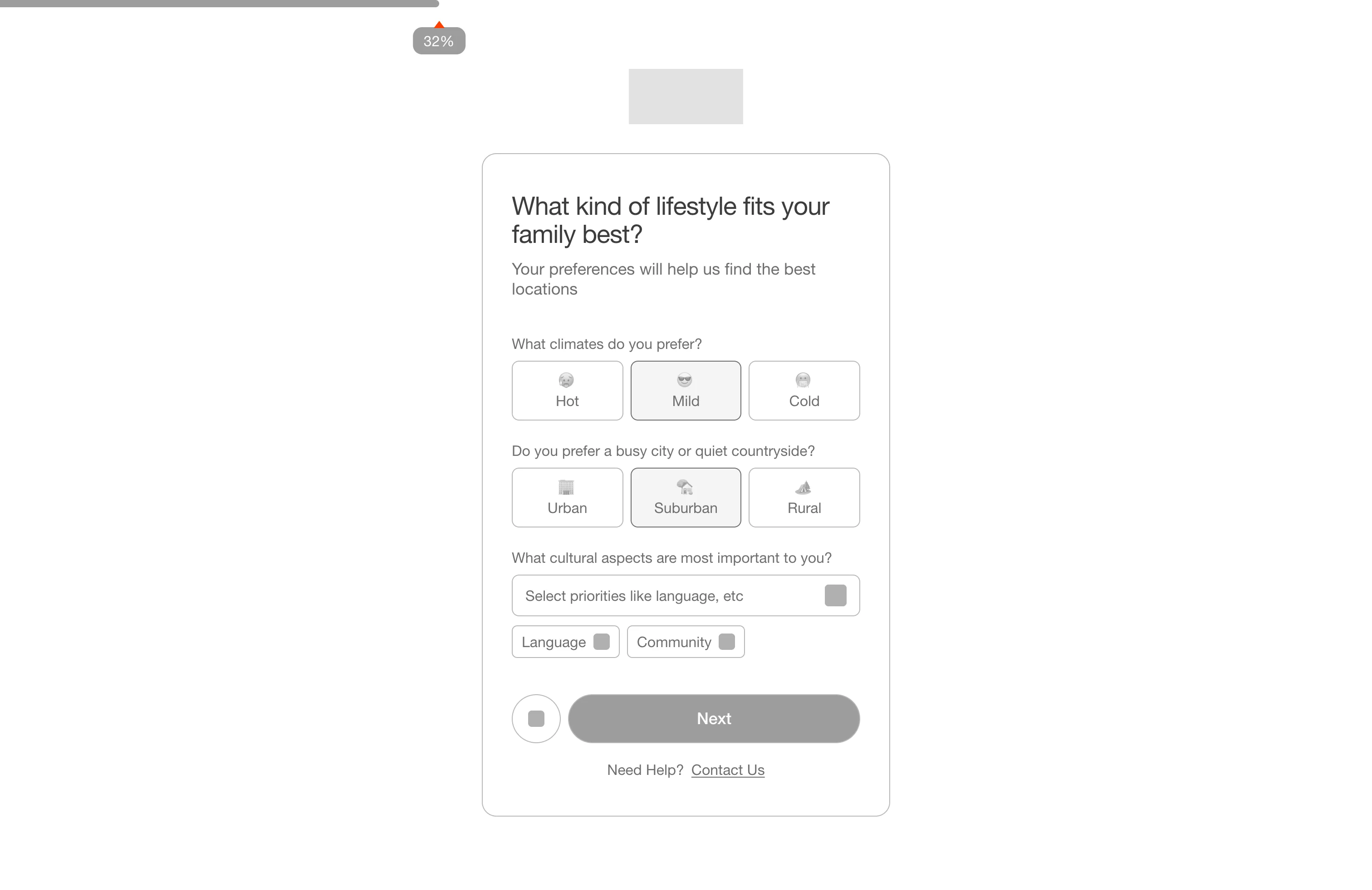
Frameworks behind the decisions
Each one solved a specific problem in a specific screen. Click a card to see it in the prototype.
Visual direction
Calm, editorial and photo-led. Real places do the selling, and one orange is reserved for action.
Click a colour to copy its hex.
Presenting it
I walked the client through the flows, IA, wireframes and the final UI in one meeting. They approved it there, and it went straight into development.
What I learned
A complete brief still needs questions. The four above changed more of the product than any screen did. And agreeing on structure in grey first made the visual review fast, because nobody was debating where things go.
Written by M Fathir Ramadhennis
Indonesia-based Product Designer with 3+ years of experience across different industries and digital products.